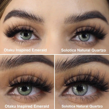
Learn More About the Difference between Solotica Natural Colors Quartzo vs Otaku Inspire Emerald Color Review.
If you're drawn to green-blue lenses but want the right balance of impact and natural finish, two popular options are Solotica Natural Colors Quartzo and Otaku Inspire Emerald.
Here’s a side-by-side close-up: Natural Colors Quartzo on the right, Inspire Emerald on the

Color and Design Comparison
Solotica Natural Colors Quartzo is a light aqua-grey lens with a noticeable limbal ring and a radial pattern. The shade is bright and cool-toned, giving a dramatic lift to dark eyes. The flower-like print adds depth, but may feel more artificial up close. Best for bold looks, photography, or if you’re used to structured lenses.

Otaku Inspire Emerald leans more emerald green with subtle blue undertones. It has a much smoother finish, with no printed pattern and a softly blended limbal ring. The result is more seamless — it lifts dark eyes without overpowering them. Perfect if you want that rare green-blue tone with a believable feel.
How They Look on Dark Eyes
- Natural Colors Quartzo: Light, bright, and icy — aqua tones with a printed ring and pattern
- Otaku Inspire Emerald: Deeper emerald-green with soft blue hints — blended, smooth finish

Opacity and Comfort
Both lenses are fully opaque on dark eyes. Solotica's thicker material offers full color payoff but may feel heavier for long wear. Otaku lenses are thinner and often described as more breathable and comfortable for everyday use.

Comparison Table
| Feature | Solotica Natural Colors Quartzo | Otaku Inspire Emerald |
|---|---|---|
| Color Tone | Aqua grey-blue | Emerald green with soft blue |
| Limbal Ring | Yes, visible and structured | Yes, soft and diffused |
| Pattern | Floral radial design | No visible print - smooth blend |
| Vibe | Bright, bold, photogenic | Natural, elegant, wearable |
| Comfort | Moderate | Lighter and breathable |
Watch Nancy’s Review
Watch Nancy’s full side-by-side review of Inspire Emerald vs Natural Colors Quartzo for live close-ups, lighting changes, and her honest take on wearability and look.
FAQs
Which lens is more natural looking?
It depends on the finish you're after. Otaku Inspire Emerald is more natural because it has a smoother blend with no visible print or harsh pattern, and the color leans into a muted emerald that mimics real eye tones. Solotica Natural Colors Quartzo, while beautiful, has a floral radial print and a brighter aqua tone that can look more striking and less blended in close-up or daylight.
Does Natural Colors Quartzo look artificial?
Not always, but it can lean that way depending on lighting and your natural eye color. The defined limbal ring and printed pattern are what make Solotica Quartzo stand out. It’s great for those who want their eye color to pop in photos or glam settings. Inspire Emerald, on the other hand, looks more like a natural eye enhancement — ideal for people who want something noticeable but soft and believable.
Do both work well on dark eyes?
Yes, both are fully opaque and designed for full transformation of brown or dark eyes. Solotica Quartzo gives a high-contrast shift with a light blue-grey effect. Inspire Emerald gives a rich emerald-green tone with a soft edge. Both are designed to cover completely without your natural color showing through.
Explore More
If you're looking for a version of these shades without a limbal ring, check out Solotica Hidrocor Quartzo vs Otaku Lover Cloud.


